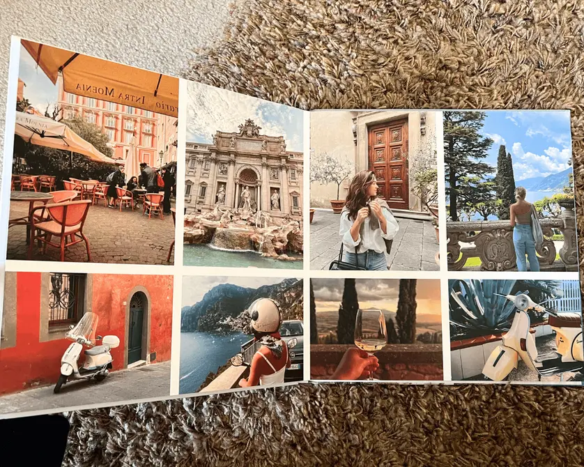
For anyone making a custom photo book, top-quality printing and papers are of the utmost importance. That’s why Mixbook prioritizes these factors in striving for 100% customer satisfaction. Our print quality has even been highlighted by the New York Times, which named us “The Best Photo Book Service” and said:
“Among the 23 books we tested, Mixbook had some of the most vibrant color pages, and the colors most closely matched the colors in our original photographs.”
It’s important, however, to be aware that the on-screen view you see while creating your photo book will always be somewhat different in appearance to the final printed version. On-screen photographs typically appear about 30% brighter than the same photos printed on paper.
It’s not a printing discrepancy. There are technical reasons for this peculiarity, and understanding them will help you know what to expect when your photo book arrives in the mail.
Overview of the Mixbook printing process
Mixbook’s photo book printing process employs the latest in digital printing technology plus the highest quality ink colors. Printing techniques are optimized for each customer’s chosen paper and cover types. Our expert print technicians strive to meticulously match the prints of your photos to the original photo files, with vivid, saturated colors, smooth gradients, and precise skin tones.
In line with universal printing industry standards, our printing process uses the CMYK color model. This means colors are created with a mixture of cyan, magenta, yellow, and black inks that are applied in tiny dots across the surface of the paper.
Why your screen view is different
Screen views of photographs (and all other images) differ slightly from printed views of photographs for a few reasons.
Firstly, screens use a different color model to printers.
While printers use the CMYK color model, screens use the RGB color model. RGB stands for red, green, and blue—the three colors of light that get mixed together to create all other colors you see on screen.
The RGB model allows for a broader range of colors than the CMYK model, so colors often appear slightly more vibrant on screen than they do in print.
Secondly, screens emit light, whereas paper absorbs light.
The colors you see on screen are created by pixels, which are tiny dots of colored light. Screens appear bright under any external lighting conditions—something that is impossible to achieve with paper and ink.
What you see vs. what you get
It’s not uncommon to discover that the photos in your printed book appear slightly darker and less vivid than they look on screen. Remember that this isn’t a printing discrepancy, but is caused by the differences in color model between screen and print views, plus the science of additive vs. subtractive color.
While you’re creating your photo book in Mixbook Studio™, be aware that the brightness and vivid colors of your screen cannot be truly replicated in print.
How to get the best print results
While you can trust our experts to do the best possible job of printing your photo book, there are some best practices to keep in mind while you’re creating your book. These tips will help you ensure the best print results:
- Use high-resolution photographs, ideally with a minimum resolution of 300 dpi. This is especially important for full-page and other large-scale photos.
- Look for pop-up error warnings in Mixbook Studio™. These will alert you to low-resolution photos and other issues that might impact print quality.
- Follow Mixbook’s recommended file formats and quality guidelines.
- Use editing tools to improve your photos before they go to print. If any of your pics appear slightly dull or dark on screen, they will also do so in print. Try adjusting the brightness, saturation, and contrast settings in the editor toolbar. Or, edit your photos with your preferred app or software before uploading them to Mixbook.
- Calibrate your monitor so that your screen view offers accurate color representation.
Related:
Still have questions or concerns?
Chat with us, send us a message., or visit our 24/7 Help Desk. Our experts will be glad to help!
